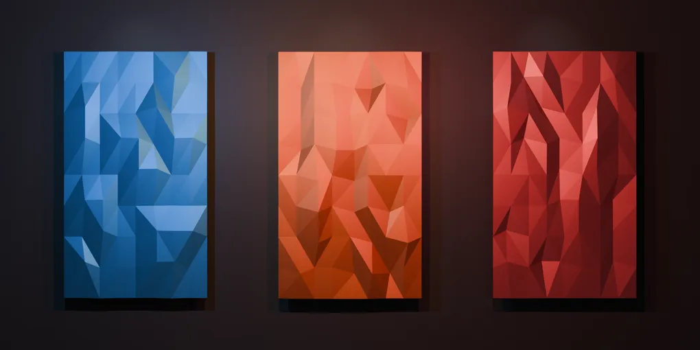
3D Interactive Card Hover
This is one of my most popular pens, so I thought I would do a writeup that dives into the “how”.
I have always liked interfaces that respond to small movements. A button changing color is useful, but having a card lean toward your cursor makes it feel like there is a little more depth behind the screen.
This effect was inspired by the 3D card interaction used in Steam’s store interface. I wanted to make a small version for the browser: a few translucent cards that tilt as the mouse moves across them, with a glare that follows the same movement.
The final result is available on CodePen.
I built this a while ago and the demo uses jQuery for event handling, but the math and CSS work just as well with vanilla JavaScript, I just haven’t updated it.
The card structure
Each card needs two layers. The outer element is responsible for the background, shadow, and 3D rotation. Inside it, the glare container clips the glare so it stays within the card’s boundaries.
<div class="card card-0">
  <div class="glare-container">
    <div class="glare"></div>
  </div>
</div>
The demo contains three cards with different translucent colors. The backdrop-filter blur lets the background show through while keeping the cards distinct.
.card {
  backdrop-filter: blur(5px);
  min-width: 35vh;
  height: 55vh;
  box-shadow: 0 0 3px rgba(0, 0, 0, 0.051),
    0 0 7.2px rgba(0, 0, 0, 0.073),
    0 0 13.6px rgba(0, 0, 0, 0.09),
    0 0 24.3px rgba(0, 0, 0, 0.107),
    0 0 45.5px rgba(0, 0, 0, 0.129),
    0 0 109px rgba(0, 0, 0, 0.18);
}

.glare-container {
  width: 100%;
  height: 100%;
  overflow: hidden;
  position: relative;
}
The glare itself is an oversized, blurred gradient. It starts outside the right side of the card and moves horizontally as the cursor moves.
.glare {
  position: absolute;
  left: 100%;
  bottom: -50%;
  width: 150%;
  height: 150%;
  background: linear-gradient(
    90deg,
    rgba(255, 255, 255, 0.1) 0%,
    rgba(255, 255, 255, 0) 20%
  );
  transform: rotateZ(35deg);
  pointer-events: none;
  filter: blur(4px);
}
Mapping the mouse to rotation
The important part is turning the cursor position into a predictable range. First, I find the cursor’s position relative to the card, then divide by the card’s width and height. This gives me offsetX and offsetY values between 0 and 1.
var limits = 15.0;

$('.card').mousemove(function (e) {
  var rect = e.target.getBoundingClientRect();
  var x = e.clientX - rect.left;
  var y = e.clientY - rect.top;
  var offsetX = x / rect.width;
  var offsetY = y / rect.height;
});
With a normalized value, I can map the left edge of the card to -15 degrees and the right edge to 15 degrees. The same idea applies vertically. The multiplication by two expands the range, and subtracting the limit moves its center back to zero.
var rotateY = offsetX * (limits * 2) - limits;
var rotateX = offsetY * (limits * 2) - limits;

$(this).css({
  transform: 'perspective(1000px) rotateX(' + -rotateX +
    'deg) rotateY(' + rotateY + 'deg)'
});
The negative value on rotateX makes the card lean in the direction I expect when the cursor moves up and down. CSS handles the actual perspective; JavaScript only needs to calculate the two angles.
Moving the glare and shadow
Once the cursor position is normalized, it can drive more than the card rotation. I use the combined rotation values to place the glare, so the highlight moves with the card instead of feeling like an unrelated animation.
var glarePos = rotateX + rotateY + 90;

$(this)
  .children()
  .children()
  .css('left', glarePos + '%');
The shadow uses a similar calculation. I create several shadows with different offsets and blur radii. The smaller shadows sit close to the card, while the larger shadows create a softer edge farther away. Scaling the cursor offset across those layers gives the impression that the card is moving above the background.
var shadowOffsetX = offsetX * 32 - 16;
var shadowOffsetY = offsetY * 32 - 16;

$(this).css({
  'box-shadow':
    (1 / 6) * -shadowOffsetX + 'px ' + (1 / 6) * -shadowOffsetY + 'px 3px rgba(0, 0, 0, 0.051), ' +
    (2 / 6) * -shadowOffsetX + 'px ' + (2 / 6) * -shadowOffsetY + 'px 7.2px rgba(0, 0, 0, 0.073), ' +
    -shadowOffsetX + 'px ' + -shadowOffsetY + 'px 109px rgba(0, 0, 0, 0.18)'
});
I left out a few of the middle shadow layers here for readability. The full version is in the CodePen below.
Resetting the card
The card should return to its resting state when the cursor leaves it. I reset the shadow, remove the rotation by scaling the card back to 1, and put the glare back at its starting position.
$('.card').mouseleave(function () {
  $('.card').css({
    transform: 'scale(1.0)'
  });

  $('.glare').css('left', '100%');
});
And here is the finished effect. Move your cursor across each card and you can see the rotation, glare, and shadow responding together.
This is a fairly small effect, but it is a good example of how a normalized value can control several visual properties at once. The card tilt, moving highlight, and shifting shadow all come from the same cursor coordinates. That shared source is what makes the interaction feel cohesive.
Keep on building!